Context:
At the beginning of this study, Signet Jewelers* aimed to enhance the checkout process across its brands, providing users with a smoother and more empowering experience as they navigated through their purchase journey. Recognizing the complexity of this task, we adopted a multi-phase approach. In phase one, we focused on identifying inefficiencies or friction points within our live site's horizontal (multi-step) checkout process. Simultaneously, we assessed the desirability and necessity of transitioning to a vertical (one-page) checkout format. Transitioning into phase two, our goal is to evaluate user feedback on the intermediate checkout flow. This flow, functioning as a modified horizontal experience, presented an opportunity to transition to a vertical checkout layout
*Signet Jewelers operates as the parent company of Kay Jewelers, Zales, Jared, Banter by Piercing Pagoda, Diamonds Direct, Blue Nile, JamesAllen.com, Rocksbox, Peoples Jewellers, H.Samuel and Ernest Jones.
5 Main Signet Domains: Shop, Purchase, Enablement, Service, Loyalty. With the coming addition of Mobile App.
I preside over Purchase as the main/lead researcher and frequently support/lead products in Shop and Enablement
Team:
1 UX Researcher (myself), 1 designer, 1 creative director, 1 project manager
Role & Collaboration:
Throughout this project, I assumed the role of lead UX researcher, collaborating closely with a designer, a creative director, and a project manager. Together, we constituted a dynamic team committed to enhancing the checkout experience for Signet Jewelers' customers. Our collaboration was instrumental as we collectively generated ideas, refined designs, and ensured alignment with the overarching business objectives. This collaborative approach enabled us to leverage diverse perspectives and expertise, ultimately driving the project towards success.
Timeline: Two 4-5 week sprints
Problem Statement:
Optimize checkout to give users more control and mobility as they navigate so they feel confident and secure moving forward with their purchase.
Why? As a business, we recognized 1) users abandoning checkout for reasons outside of cost and 2) an industry shift from multiple-page checkout
Goals:
Understand customer needs as they progress through the checkout process.
Identify essential information that aids users in completing their purchase.
Explore user preferences and perceptions regarding checkout ease, structure, and duration.
Evaluate whether the intermediate prototype effectively addresses user needs for a quick and efficient checkout.
Methodology:
We employed a mixed-methods approach, combining qualitative and quantitative research methods:
Phase 1 -
8 moderated interviews to gain in-depth insights into user experiences and preferences.
Comparative analysis of the live site’s intermediate” checkout flow vs 1 competitor (Mejuri) and 1 comparator (Sephora)
Supplemented by a 10-participant unmoderated study of Nordstrom checkout address payment methods, accounts/guest checkout, text fields, payment options
Phase 2 -
6 moderated interviews to gain in-depth insights into user experiences and preferences.
Comparative analysis of the current live-site checkout flow and a proposed modified checkout prototype.
Recruitment Criteria and Process:
Participants were recruited based on specific criteria:
Users who have purchased jewelry within the past 6 months or intend to do so in the next 6 months.
Half of the participants had previously shopped at Signet brands, providing diverse perspectives. Screener questions were designed to identify relevant participants and ensure a representative sample.
Follow-up research:
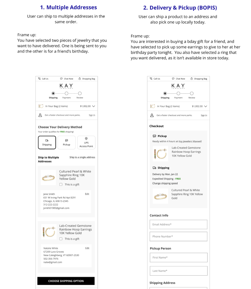
This guided checkout research laid the foundation to address additional initiatives such as mixed delivery (ship to address/BOPIS), digital wallet enhancements, and user payment sentiments
As it stands we are entering another phase of refinement for the checkout flow, hoping to shift to a full
Key Research Questions Phase 1:
What might enhance a checkout flow?
General: What is the users’ preference between vertical and horizontal checkout?
Shipping: How do users engage with shipping?
Billing: How do users perceive language used in the payment section?
Review: What are users expecting from a review section?
Key Research Questions Phase 2:
How functional is the intermediate checkout flow within the purchase journey?
How efficiently are user needs being met throughout the checkout process?
What essential features might be missing, hindering a seamless checkout experience?
How does the intermediate checkout flow contribute to users' ability to complete their purchases?
Shipping: How effectively can users identify and enter shipping information in the current iteration?
Billing: How easily can users navigate payment methods and complete the payment process?
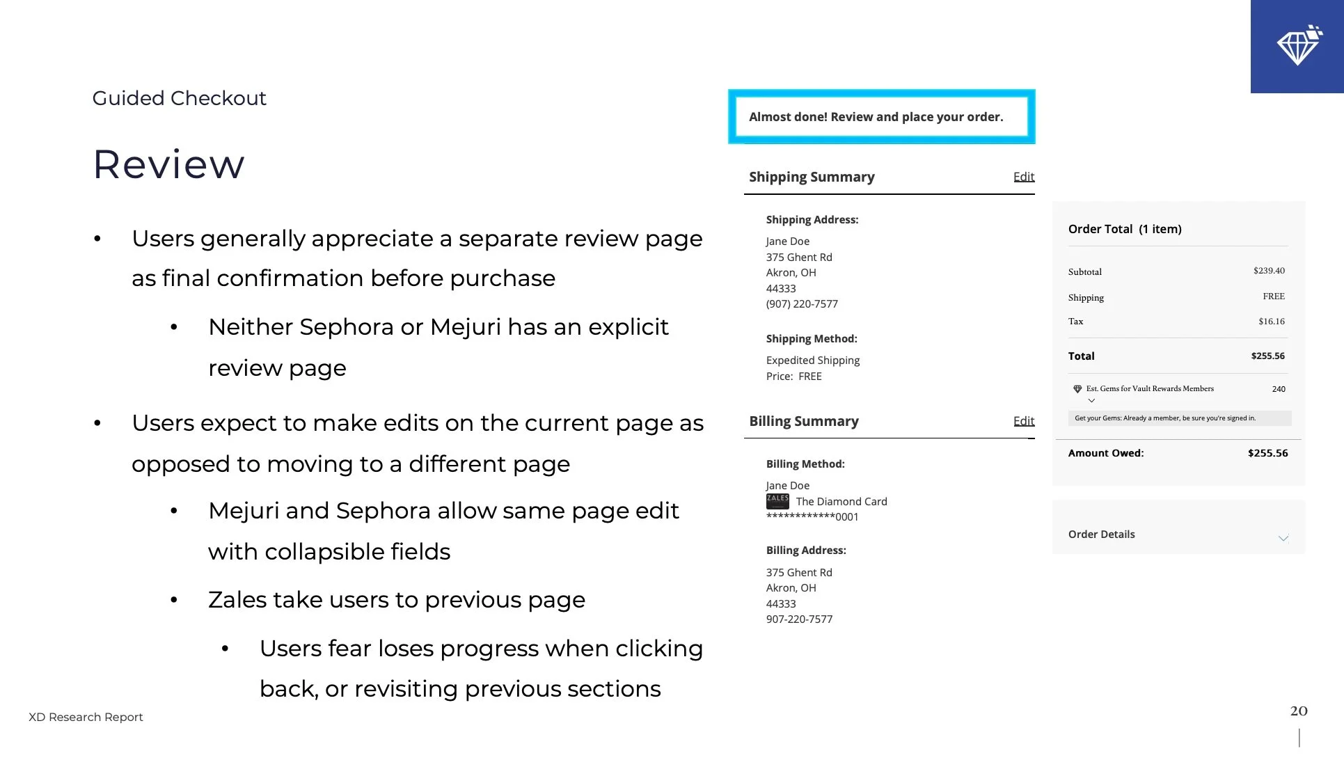
Review: How effectively does in-line editing enable users to review their order before finalizing the purchase?
What additional features do users expect, and how might they enhance the purchasing journey?
How can live features be improved to better assist users in completing their purchase?
Success Criteria:
Our success criteria for this project were primarily qualitative, focusing on gaining insights into user frustrations and areas for improvement within the checkout process. Specifically, we aimed to:
Identify pain points and friction in the current checkout experience by understanding what frustrated users.
Ensure that no users fail to complete the checkout process on our proposed prototype, indicating its usability and effectiveness.
Gauge user preference for the proposed prototype over the live site, with a preference for the former indicating a potential shift towards vertical checkout.
By prioritizing these qualitative success criteria, we aimed to uncover actionable insights that would inform the design and optimization of the checkout process for Signet Jewelers' brands.
Main Takeaways and Recommendations
Preference for Vertical Checkout: Users expressed a clear preference for vertical checkout over horizontal checkout, citing its efficiency and ease of navigation as key factors. This underscores the importance of transitioning towards a vertical checkout format to meet user expectations for a streamlined checkout experience.
Efficiency of Quick Pay Options: Quick pay options emerged as the preferred method for expediting the checkout process. However, it's crucial to consider the implications for users who may be purchasing items as gifts, necessitating additional flexibility in checkout options.
Enhanced User Assistance: Implementing autofill functionality for shipping information, particularly addresses, and debit/credit card details significantly improved user experience by expediting the checkout process. This feature should be prioritized to enhance user convenience and confidence during checkout.
Benefits of Vertical Checkout Design: Vertical checkout design facilitates user progress through the checkout process by providing visibility into prior sections and enabling users to make edits without losing progress. However, some users expressed a desire for a dedicated review page, indicating a need for further optimization in this area.
In-Line Editing for Enhanced Confidence: Users appreciated the ability to edit directly from the review step, as it instilled confidence and comfort in the checkout process. Implementing in-line editing functionality enhances user control and contributes to a more seamless checkout experience.
Based on the research findings, we recommend the following initiatives to enhance the checkout experience:
Prototype Implementation: Given the preference for the proposed prototype and the clear advantages of vertical checkout, we recommend implementing the “modified horizontal” prototype as an interim solution while planning for a full transition to vertical checkout. This will address immediate user needs while laying the groundwork for future enhancements.
Integration of Quick-Pay Options: Integrate quick-pay options to expedite the checkout process further. However, ensures flexibility to accommodate users purchasing items as gifts, balancing efficiency with user preferences.
Autofill Functionality: Prioritize the implementation of autofill functionality for shipping information and debit/credit card details. Explore tools and APIs that leverage map data or local phone data to enhance autofill accuracy and efficiency.
In-Line Editing and Review Optimization: Enhance the review step by implementing in-line editing functionality and exploring opportunities to optimize the review process further. Consider user feedback on payment methods, UX enhancements for gifting experiences, and options for shipping bundles (Mixed Delivery) to further refine the checkout experience.
Impact of work:
Through implementing the identified tactical and experiential improvements onto our live site, the Payments & Financing teams (Purchase domain) exceeded revenue goals (target: $15.1M, actual: $25.48M)
Over 3 years, Purchase alone is responsible for “incremental checkout success of over 15% leading to $242M in benefit”


